---
title: "Render image fields using transformation settings"
slug: "render-image-fields-using-transformation-settings"
abstract: "Learn how to use Sitecore Content Hub transformations."
---
# Render image fields using transformation settings
SXA lets you [add the Responsive Image field](https://doc.sitecore.com/xp/en/developers/sxa/105/sitecore-experience-accelerator/render-image-fields-using-the-responsive-image-variant.html "Render image fields using the Responsive Image variant") to scale and size your images correctly. If you work with the Sitecore Content Hub, you can also use the transformations set there for your SXA images. To do that, you must create a mapping in Sitecore that you can use in the responsive image variant item definition.
Set the transformation
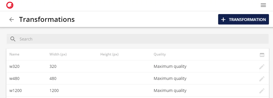
To specify the image width, height, and quality:
1. Open the Sitecore Content Hub, and on the ribbon, click **Manage**.
2. Click **Settings**, and click **Transformations** and specify image width, height, and quality. For example:
Create the transformation mapping item
For each transformation definition in the Sitecore Content Hub, you must create a transformation mapping item.
To add a transformation mapping:
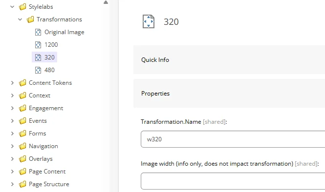
1. In the Content Editor, navigate to:
*/sitecore/system/Settings/Feature/Experience Accelerator/Stylelabs/*, right-click **Transformations**, click **Insert**, and click **Transformation**.
2. Enter a name and click **Ok**.
3. In the **Properties** section, in the **Transformation.Name** field, enter the transformation name from the Sitecore Content Hub.
Configure the rendering variant
To add the mappings to the Responsive Image rendering variant:
1. In the Content Editor, click the Responsive Image item of your rendering variant.
2. In the **Stylelabs Variant Details** section, in the **MWidths** field, specify the widths. Use the left column to specify the maximum image width, and the right column to select the transformation mapping item.
When you now add a rendering to a page, and select a Stylelabs image in your datasource and apply rendering variant with `MWidth` mapping, the transformation settings will be used.
Depending on the screen size, a different image will be loaded. Links are similar to links without transformation mapping, but adds parameter *t* for sizes with assigned transformation name.