Walkthrough: Adding a bar chart to an Experience Analytics report
Sitecore Experience Analytics provides dashboards and reports for marketers and marketing analysts to identify patterns and trends in experience data. This data is collected from websites and other external data sources.
You can add bar, line, list, or area chart components to reports using Sitecore Rocks depending on your business needs. For example, you can add a Conversions by country bar chart to the Audience/Overview report to display how much engagement value is generated on your website by country.
This walkthrough describes all the steps to add a bar chart component to an experience analytics report:
-
Add a chart component to a report
-
Add a parameters item to the report
-
Bind the bar chart control to the parameters item
-
Change the chart title
To add any chart component to a report, you must use Microsoft Visual Studio, Sitecore Rocks, and access to a Sitecore website. In Sitecore Rocks, you must also configure a connection to your website.
Add a chart component to a report
Add a chart component to a report
Before you can add a chart component to a report, you first need a report page.
To add a chart component to a report page:
-
In Sitecore Rocks, right-click a report page, click Tasks and then click Design Layout.
-
In the Design Layout window, click AddRendering.
-
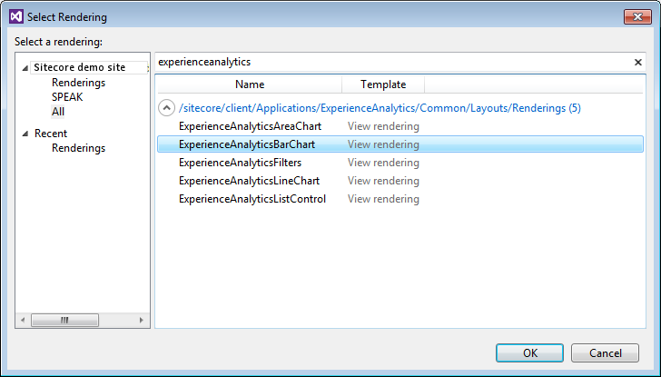
In the Select Rendering dialog box, select a chart control to use in your report page.
To find all available chart controls, enter a search term beginning with experienceanalytics. You can choose from an area chart, bar chart, list, or line chart. For example, to display a bar chart, select the ExperienceAnalyticsBarChart rendering.
-
Choose a chart type and click OK to save your changes.
Add a parameters item to the report
Add a parameters item to the report
You need a parameters item to configure report metrics and other settings in your chart. A parameters item is a subitem of the PageSettings item.
To add a parameters item:
-
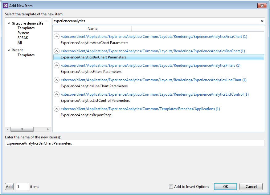
On the report page, right-click the PageSettings item and click Add - New Item.
To find all available chart parameter controls, enter a search term beginning with experienceanalytics. You can see parameters items for each type of chart control. For example, if you are using the bar chart control, select the ExperienceAnalyticsBarChartParameters item.
-
You can enter a name for your parameters item or accept the default name, then click OK.
-
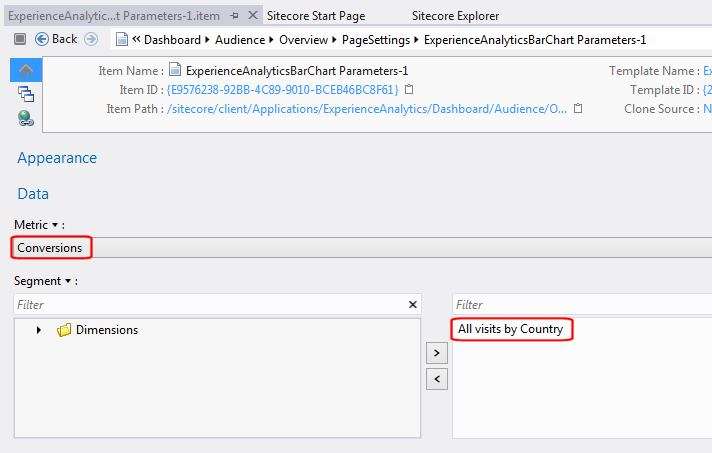
To configure the parameters item, double click the item to open it.
-
In the parameters item, select a metric and add a segment to your chart.
-
For example, to show conversions from all visits by country, select the following:
-
Metric = Conversions
-
Segment = All visits byCountry
-
-
Save your changes.
Bind the bar chart control to the parameters item
Bind the bar chart control to the parameters item
If you do not bind the bar chart control to the parameters item, your report will not display any data.
To bind the ExperienceAnalyticsBarChart control to the parameters item:
-
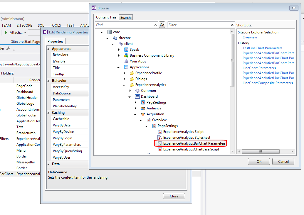
Right-click the report, click Task, Design Layout, and then double-click the chart item that you have created. For example, double click the ExperienceAnalyticsBarChart control.
-
In the Edit Rendering Properties dialog box, in the Behavior section, in Data Source, browse to the location of the ExperienceAnalyticsBarChartParameters item in the content tree.
-
Select the parameters item and click OK.
-
Save your changes.
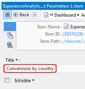
Change the chart title
Change the chart title
Your new chart needs a heading to describe the content that it displays.
To change a title label on a chart:
-
Double-click the parameters item for your chart.
-
In the parameters item, expand the Appearance section.
-
In the Title field, enter the relevant title, for example, Conversions by country.
-
Save your changes and view the chart in Experience Analytics.