Create a custom theme
Themes define the look and feel of a site and can be created separately from the site functionality and content. By default, SXA comes with two types of themes:
-
Site Themes (/sitecore/Media Library/Themes) – branding themes that contain scripts and styles that are responsible for the look and feel of your site. For example, renderings styling (navigation, carousel, and so on) and renderings behavior (if necessary a custom one).
-
Base Themes (/sitecore/Media Library/Base Themes) – foundation themes that contain scripts and styles that deliver more complicated functionalities. For example, shared functionalities such as Bing/Google maps connector, Core Libraries (jquery, lo-dash), and scripts that influence the editing experience (sticky notes, editing themes, drag and drop, and partial designs highlighting).
To add your own classes and assets, such as styles, scripts, images, and fonts, you can create a new site theme.
To create a site theme:
-
Add a new theme in one of the following ways:
-
Add a theme when creating your site. In the Create a new Experience Accelerator site dialog box, on the Theme tab, select the Create new theme checkbox.
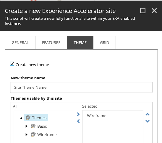
The new theme is added to the Site folder in the Media Library:
/sitecore/Media Library/Project/Tenant Folder/Your Tenant/Your Site/Site Theme Name
-
Add a theme manually. Add a theme under your tenant/site media library folder. Copy all children of /sitecore/media library/Themes/Basic theme.
-
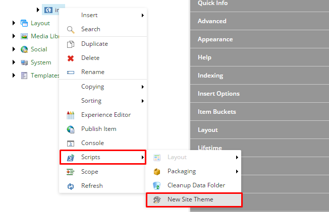
Add a theme using a script. SXA contains a helper script that creates a new theme for you. Right-click your site, click Scripts, and click New Site Theme.
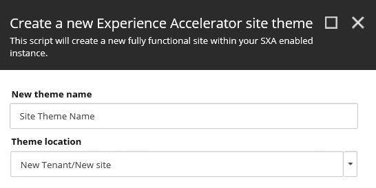
In the Create a new Experience Accelerator site theme dialog box, enter a name and optionally enter a new location for your theme. By default, the new theme is added to: /sitecore/Media Library/Project/Tenant Folder/Your Tenant/Your Site/Site Theme Name.
 Note
NoteBy default, new themes are stored here: /sitecore/Media Library/Project/Tenant Folder/Your Tenant/Your Site/Site Theme Name. Do not save your theme items under any of the SXA roots as they might be overwritten in the next release.
-
-
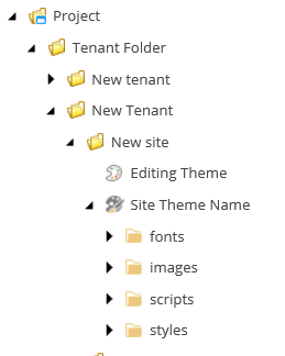
By default, the new theme contains the following folders: fonts, images, scripts, and styles. Use the scripts and styles folder to add CSS styles and JavaScripts.
 Note
NoteThe fonts folder is optional and is an example of how you could organize your fonts assets. The image folder is also optional but some CSS can use image references to a set path.
-
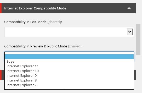
In the Internet Explorer Compatibility section, set the X-UA-Compatible value. This value forces Internet Explorer to use a specific Edit and Preview/Public mode to render your web pages. For example, you can set the value to IE Edge to use the highest, most recent mode available.
-
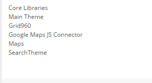
In the Theme section, set the themes your new theme should inherit from. SXA themes support multiple inheritance. This means that you can define multiple parent themes for every single theme.
NoteThe order of selected base themes is important. Be careful when you are adding something new or changing the order. For example, if the SearchTheme relies on jquery library that is located in Core Libraries, you must make sure that the SearchTheme is loaded after the other themes.
-
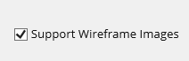
If you want your images to be turned into wireframe images, select the Support Wireframe Images check box.
-
In the Global Classes section, you can override some of the standards that come with the SXA grid and specify that your footer, header, and content placeholders will have full width.
-
WideHeader – select to make the header placeholder use 100% of the screen width.
-
WideContent – select to make the content placeholder use 100% of the screen width.
-
WideFooter – select to make the footer placeholder use 100% of the screen width.
-
OtherClasses – specify a value to render into a class attribute of the HTML body tag on each page using this theme.
-
-
In the Viewport field, enter a <meta> viewport element. The viewport is the user's visible area of a web page that varies with the device. You can take control over the viewport, using the <meta> tag. This <meta> viewport element gives the browser instructions on how to control the page dimensions and scaling. If your meta partial design contains a Viewport rendering, the value of this field is used to fill this meta tag. For example:
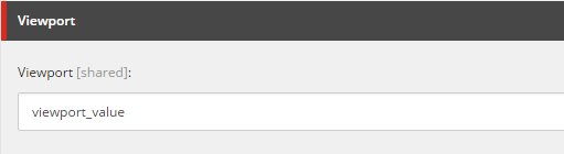
Renders the following on the page:
<meta name="viewport" content="viewport_value">