Create a rendering variant
SXA comes with a set of default renderings and rendering variants. Rendering variants are configurable adaptations of the default renderings. To encourage reusability, designers and front-end developers can also create new rendering variants. This gives authors more options in the way they present their content.
You can create your own variation of a rendering by adding a variant in the Content Editor.
To create a rendering variant:
-
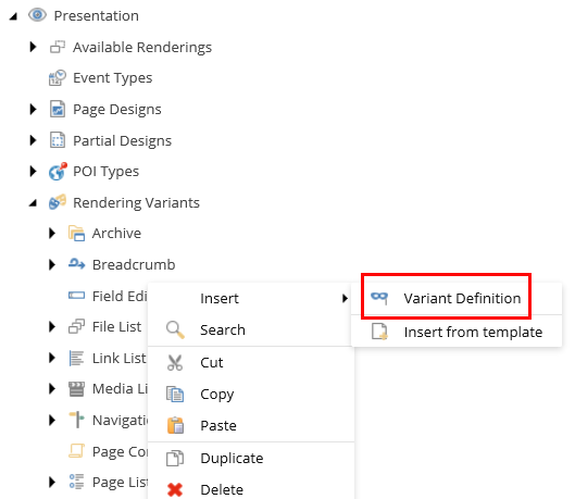
In the Content Editor, click the site and open the Presentation/Rendering Variants folder. This folder lists all the renderings that allow variants.
NoteTo add a rendering to the folder, contact your Administrator.
-
Right-click the rendering that you want to add the variant to, and then click Insert, Variant Definition.
-
Enter a name and click OK.
-
In the Variant Details section, specify information in the following fields:
-
Field used as link target: provide the field name of the target item. This class is added to the list and navigation items markup (
liHTML element). This link is used to override all links when the Is link, Is prefix link, or Is suffix link check boxes are selected. -
Allowed in templates: specify the pages that the variant is available for. Click the relevant page template, click the right arrow to move it to the list of selected items, and then click Save. If there are no templates selected, the variant is available for all pages.
-
Compatible renderings: Makes rendering variant available for other renderings. For example, if for a Page Content rendering variant, in the Compatible Renderings field, you specify Title, you can use the rendering variant for the Title rendering as well..
-
Css Class: Specifies class to render into rendering content element. For example:
-
Item Css class field: Specifies field name of the rendered item from which the CSS class will be taken and rendered into class attribute. Supported for Navigation rendering only
-
-
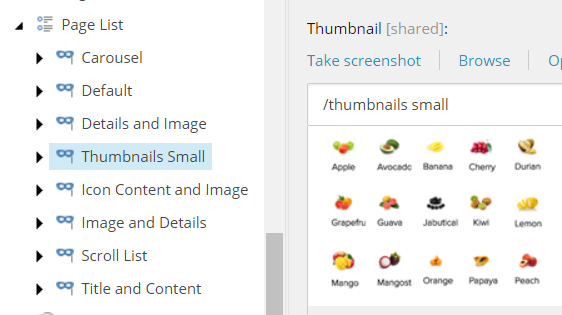
Optionally, in the Appearance section, you can add a thumbnail image for the variant. This image will appear in the variants drop-down box and can help content editor select the best variant for their purpose.
Content Editor
Experience Editor
 Note
NoteRendering variants without a thumbnail display with their name only.
-
To define the fields that will be displayed, you can add child items to the rendering variant, right-click the variant, click Insert, and then click the relevant item.
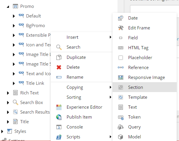
These are the child items available for a rendering variant:
-
Date: displays data and time in custom format. To be able to display date and time in custom format you have to use the Date item. This item is similar to the Field item but has an additional field: "Date format" that allows you to choose a date and time format. Like the Field item, the Date item can be used as fallback item and can have its own fall back items defined.
NoteThe fields and variant details are described in a table below.
-
Edit Frame: variant item that can be used in the Edit mode.
-
Field: displays field name and other field values.
-
HTML Tag: enables users to render HTML self-closing tags.
-
Model: displays properties from the current Model. The SXA renderings model inherits from
Sitecore.XA.Foundation.Mvc.Models.RenderingModelBase. In the Property path field, you can enter the path to the property that you want to display. -
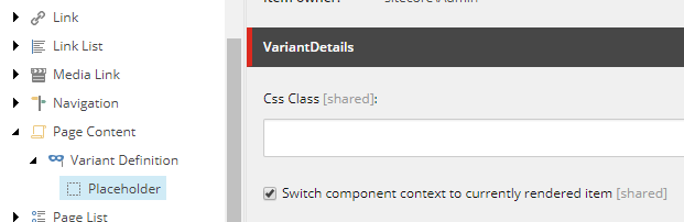
Placeholder: renders a placeholder that enables users to add additional renderings. If you want the user to be able to switch context for the renderings inside this placeholder, go to the VariantDetails section and select the Switch component context to currently rendered item checkbox.
-
Reference: displays field from referenced item. If you want to display a field from a referenced item, you can define this field in the PassThroughField. You can use this variant field for the following fields: LinkField (GeneralLink, DropLink), FileField (File), ImageField (Image), and ReferenceField (Droptree). Reference items can contain have another reference item as its child item. This can be convenient when you want to create a tree of reference items and display fields from items which are referenced in referenced items.
-
ResponsiveImage: enables to define the default size as well as the allowed sizes and width of images. Making your images responsive means that your browser serves a different sized version of that image based on the size of the image on your page and the screen resolution. The values entered in the Variant Details section will be combined in a
srcsetattribute. The values in the following screenshot will generate the following img tag: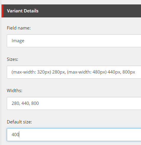
-
Section: used to create groups. Section contains fields such as Tag (to create wrapping element for the section, for example "div") and CssClass (to add a css class to the wrapping tag). You can nest Section items to create more complex variant structure.
-
Template: allows user to define NVelocity template which will be used to render part of the HTML. The getVelocityTemplateRenderers pipeline can be used to add a custom renderer that later on can be used in the NVelocity template.
NoteNVelocity is a .Net-based template engine. It permits developers to use the simple yet powerful template language to reference objects defined in .Net code.
-
Text: displays text. Used to render custom string of for example a description. You can use the following fields: Text, Tag (define additional tag that will wrap text), CssClass (the css class that will be added to the tag), IsLink (if selected then custom text will be additionally wrapped by hyper link to the current item).
-
Token: SXA supports tokens:
$Size: displays size of a file depending on size unit.$FileTypeIcon: displays icon depending on file extension.$id: displays id of an item$name: displays name of an itemThe custom pipeline resolveVariantTokens can be used to extend the set of variant tokens.
-
Query: allows to specify a query that will be will be run on current context item. This enables you to query child items or use SXA tokens. For example, if you want the rendering variant to display only for the child items of a certain template. You must start your query with query and then use standard Sitecore query syntax. You can combine Sitecore queries with SXA tokens such as $home and $site.
Depending on the item you add, you can set the following fields:
Field
Variant details
Tag
HTML tag used to wrap rendered field content. For example:
divIf left empty field content will remain unwrapped.
Field name
Name of the field from the item used for rendering content.
Prefix
Adds string value as a prefix.
Suffix
Adds string value as a suffix.
Is link
Select to have hyperlinks that wrap the field content.
Is prefix link
Select to wrap prefix in the same link which you use for the field content.
Is suffix link
Select to wrap the suffix with a hyperlink.
Is download link
Select to have a hyperlink with a download attribute.
Css class
Adds Css class to the tag.If Tag field is not specified, CSS class will not be rendered.
Is editable
Select to edit rendered field.
Date format
Determines the date format.
Render if empty
Select to render empty element when the field is empty.
Pass through field
Defines the name of the field from the nested item.
Text
The text to render.
Template
Define the NVelocity template that renders part of the component variant HTML. You can use the following objects:
$item: access to the current item ($item.Namedisplays current item name).$dateTool.Format(date, format):formats date and time values.$numberTool.Format(number, format): formats numbers.$geospatial: in case of geospatial search ($geospatial.Distance) will show distance to certain point of interest).Token
Use special tokens to format certain field values. Supported tokens are:
$Size: displays size of a file depending on size unit.$FileTypeIcon: displays icon depending on file extension.$id: displays id of an item$name: displays name of an itemQuery
Determines the query that will be run on the current context item. For example:
To get all child items:
query:./*To get all items of Page template from under the current item:
query:..//*[@@templatename='Page']To get all items of Page template from under Home item of the current site:
query:$site/*[@@name='Home']//*[@@templatename='Page']Maximum number of results
Enter a number to limit the number of items returned.
Property path
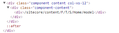
In the Property path field, you can enter the path to the property that you want to display. For example,
Item.Paths.Pathwill access Item property from Model, then dig deeper and access the Paths property and then the Path string.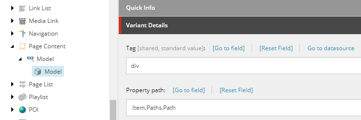
Data attributes
Adds a data attribute to the HTML element generated by the rendering variant item.
Link attributes
Adds a link attribute to the link element generated by the rendering variant.
Buttons
Edits frame buttons. Go to:/sitecore/content/Applications/WebEdit/Edit Frame Buttons to select a button.
Placeholder Key
Defines placeholder key used for rendering placeholder.
DefaultSize
Determines the default size of a responsive image. Used to generate responsive image syntax. For example,
Sizes
Defines media conditions for a responsive image and indicates what image size would be best to choose. Used to generate responsive image syntax. For example,
Width
Determines available widths for a responsive image. Used to generate responsive image syntax. For example,
-