Add Accordion, Carousel, Flip, and Tabs renderings
Accordion, Carousel, Flip, and Tabs are composite renderings. A composite rendering enables you to compose a more complex rendering from other renderings.
This topic describes how to:
Add the Accordion rendering
Add the Accordion rendering
The Accordion rendering lets you stack a list of collapsible sections either vertically or horizontally. You can use an accordion to display FAQs, sets of thumbnails, or divide longer documents in sections. Each section can be expanded to reveal the content associated with that item.
Collapsing a page with an accordion minimizes scrolling, which can be very useful for content-rich pages or on pages where the content is restricted to very small spaces, for example, on mobile devices. This allows people to decide what to read or what to ignore, and can make the webpage appear less overwhelming.
To add the Accordion rendering:
-
Drag and drop the Accordion rendering to the page.
-
In the Select the Associated Content dialog box:
-
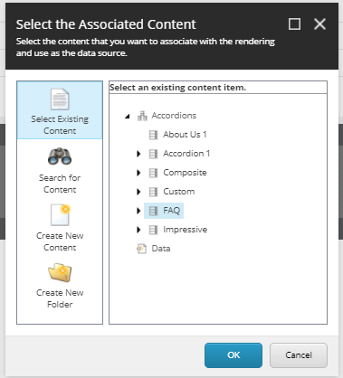
To select an existing content item, click Select Existing Content, then click the content item that you want and click OK.
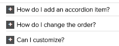
For example, if you select an existing FAQ section, the FAQ content item automatically populates the accordion:
-
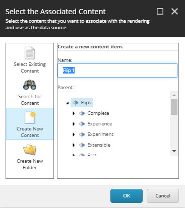
To create new accordion content, click Create New Content and click OK and then to add an accordion section, click the plus button:
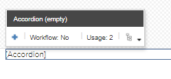
-
-
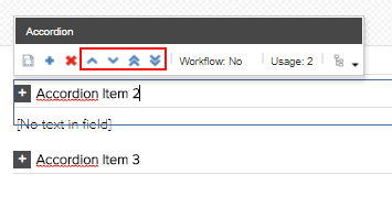
If you have added more than one accordion section, you can change the order of the sections by using buttons in the toolbar.
Change the appearance of an accordion
Change the appearance of an accordion
You can change how an accordion is displayed on the page.
To change an accordion's appearance:
-
On the floating toolbar of the accordion, click Edit the Component Properties.
-
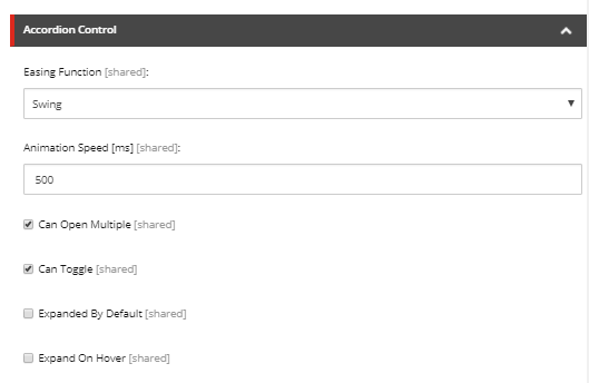
In the Accordion Control section, determine the accordion's appearance by editing the following fields:
-
EasingFunction – click the type of expand/collapse animation. For example, swing, back, bounce, quint.
-
Animation Speed – specify the speed (in milliseconds) of the animation. For example, enter 600 for slow, 400 for normal, or 200 for fast.
-
Can Open Multiple – select to enable expanding multiple sections at the same time.
-
CanToggle – select to allow toggling of sections.
-
ExpandedbyDefault – select to have the first section expanded when you open the page.
-
ExpandonHover – select to expand sections when you hover your mouse over the section title.
-
-
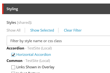
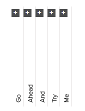
In the Control Properties dialog box, in the Styling section, you can choose different styles for your accordion. For example, to have an accordion that is displayed horizontally, select Horizontal Accordion.
Add the Carousel rendering
Add the Carousel rendering
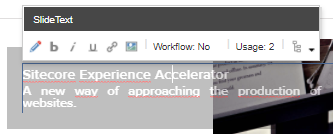
The Carousel rendering allows you to define a set of rotating slides – usually images – accompanied by descriptions and links. Carousels are often used at the top of home pages, but you can place them on any page. For example, you can use a carousel to display a number of featured pages, to describe a step–by–step process, or to display product images. The items in a carousel appear one at a time in a defined order. By default, the carousel rendering includes a slide image and a slide text item.

You can determine the carousel's appearance by defining the slide layout, navigation type, slide transition effect, and so on.
You can edit each slide and customize it by adding or removing elements (such as texts, links, images, and videos). You can modify the text and image by clicking the options in the floating toolbar.
To add the Carousel rendering:
-
Drag and drop the Carousel rendering to the page.
-
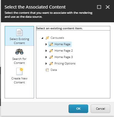
In the Select the Associated Content dialog box:
-
To select an existing content item, click Select Existing Content, click the content item that you want and then click OK.
For example, if you already have a Home Page section ready, the carousel automatically fills with the items in the Home Page:
-
To create a new content item for the carousel and add carousel slides directly on the page, click Create New Content and click OK, and then click the plus button:
-
Add the Flip rendering
Add the Flip rendering
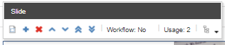
The Flip rendering lets you work with two items: the front (visible) and the back (hidden). These two items are shown alternatively after you either click or hover over the item. For example, you can use the flip rendering for staff member photographs and profile information, or for coupons and redeem codes.
To add the Flip rendering:
-
Drag and drop the Flip rendering to the page.
-
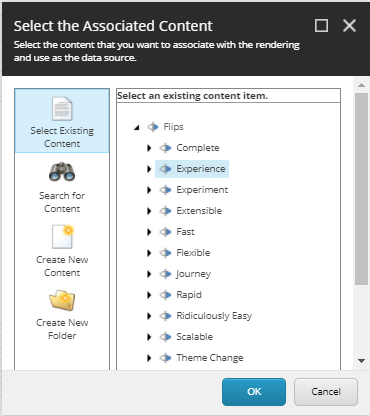
In the Select the Associated Content dialog box:
-
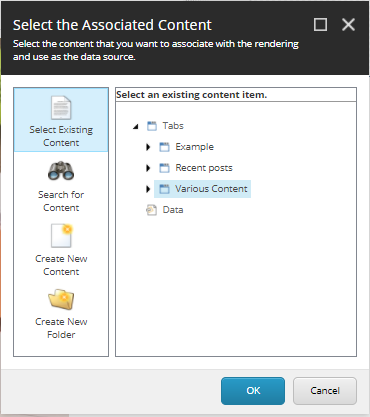
To select an existing content item, click Select Existing Content, click the content item that you want and click OK.
The flip rendering will automatically fill with the data in the content item:
-
To add new content, click Create New Content:
-
-
In the Control Properties dialog box, in the Styling section, you can select different transition modes, such as Transition on hover and Transition - Rotate vertically.
Add the Tabs rendering
Add the Tabs rendering
The Tabs rendering lets you display content within a tabbed layout, where the content of only one tab is visible at a time. Tabs are very effective when you want to display related information in a structured way. For example, you can use the Tabs rendering to organize blog posts into categories, such as recent posts, popular posts, and most commented posts.
To add the Tabs rendering:
-
From the toolbox, drag the Tabs rendering to the page.
-
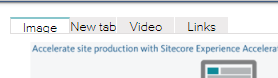
In the Select the Associated Content dialog box, click the content item that you want and click OK.
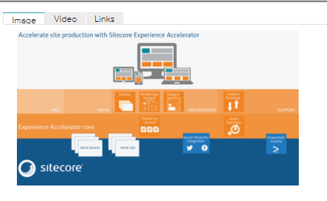
For example, the Various Content content item contains the Image, Video, and Links tabs:
-
To change the styling, in the floating toolbar, click Edit the Component Properties.
-
In the Control Properties dialog box, in the Styling section, determine the appearance of the tabs by selecting a style.
For example, to outline the tabs on the left, click Tabs on left and then click OK.
NoteIf you select the Tabs at bottom style, in the Tabs Control section, you must also select the Tabs at the Bottom check box.
-
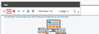
To add a new tab, in the floating toolbar, click Insert a new item.
-
In the Insert item dialog box, click Tab Item, enter a name and click OK. The new tab item is added and you can fill the tab.