Composite renderings
A composite rendering consists of several renderings. Each instance can have its own layout and it can be designed separately in Experience Editor. When a composite rendering is rendered on the page, it queries each item from its data source and pulls data and layout. This facilitates building very complex layouts, but also involves a more advanced setup.
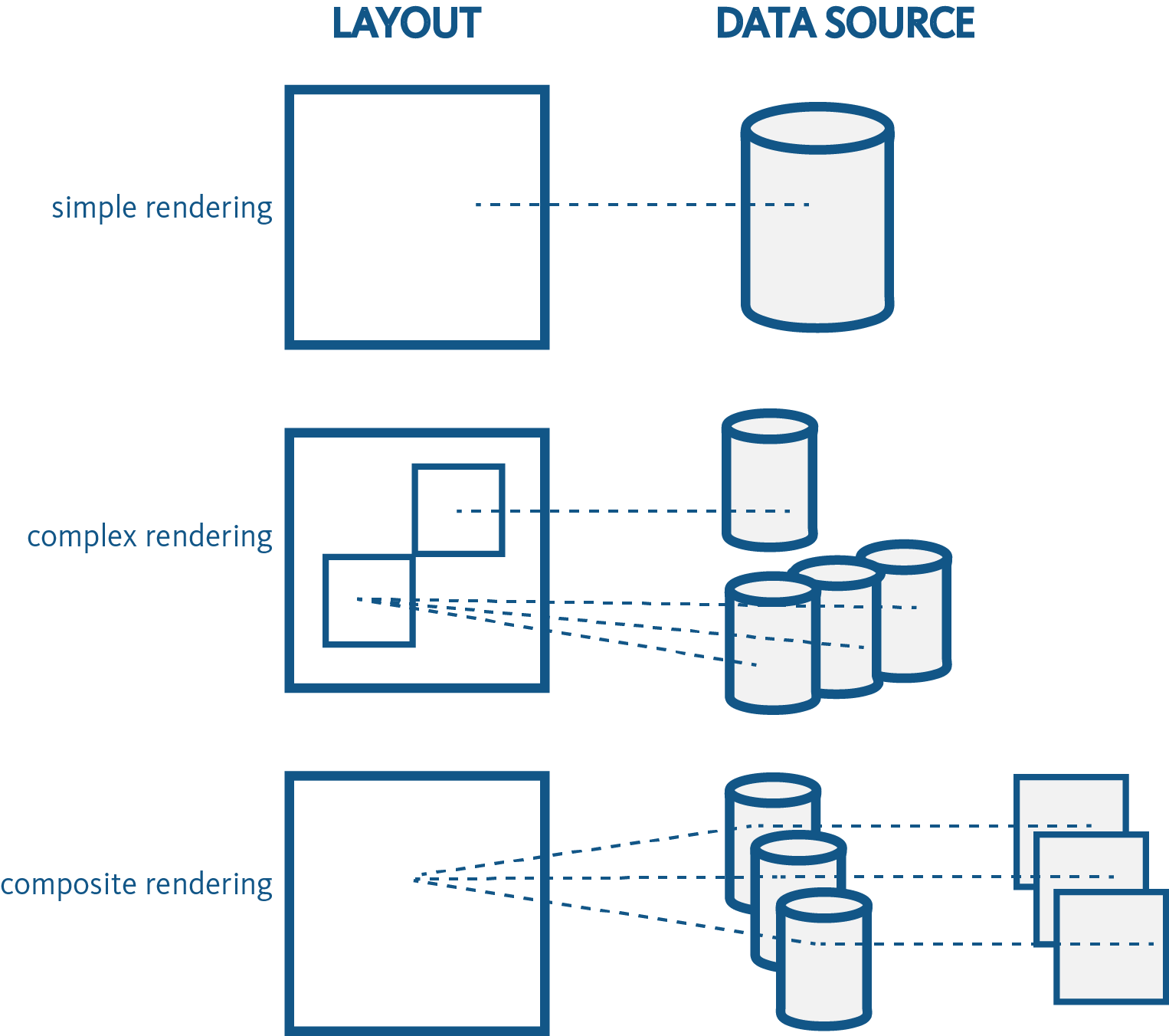
Simple renderings, such as Image, Text, and Video, consist of a layout and use single data source items to provide the content. Complex renderings, such as a container or a splitter, contain multiple simple or complex renderings. These renderings have one layout definition and all added renderings are defined in a renderings page property. Composite renderings, such as Accordion, Carousel, and Toggle, use all data sources with their own layout. In the Renderings field, only references to data source items are stored. Therefore, related layouts are not rendered out-of-the-box.
By default, SXA contains these composite renderings:
-
Carousel: The Carousel rendering lets you to define a set of rotating slides – usually images – accompanied by descriptions and links. Carousels are often used at the top of home pages, but you can place them on any page. For example, you can use a carousel to display a number of featured pages, to describe a step–by–step process, or to display product images. The items in a carousel appear one at a time in a defined order. By default, the carousel rendering includes a slide image and a slide text item.

-
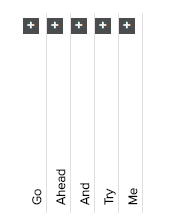
Accordion: The Accordion rendering lets you stack a list of collapsible sections either vertically or horizontally. You can use an accordion to display FAQs, sets of thumbnails, or divide longer documents in sections. Each section can be expanded to reveal the content associated with that item. Collapsing a page with an accordion minimizes scrolling, which can be very useful for content-rich pages or on pages where the content is restricted to very small spaces, for example, on mobile devices. This allows people to decide what to read or what to ignore, and can make the webpage appear less overwhelming.
-
Flip: The Flip lets you work with two items: the front (visible) and the back (hidden). These two items are shown alternatively after you either click or hover over the item. For example, you can use the flip rendering for staff member photographs and profile information, or for coupons and redeem codes.
-
Tabs: The Tabs rendering lets you display content within a tabbed layout, where the content of only one tab is visible at a time. Tabs are very effective when you want to display related information in a structured way. For example, you can use the Tabs rendering to organize blog posts into categories, such as recent posts, popular posts, and most commented posts.
-
Snippet: The Snippet rendering lets you create a reusable group of renderings. It is a composite rendering that consists of several renderings that can be designed separately in the Experience Editor. In the same way as with partial designs, you can group different kinds of renderings and reuse this group in different locations. The difference between a snippet and a partial design is that snippets are extensible, you can change the styling, and you can use them as often on the page as you want.