Commerce Cart renderings
You can add the Commerce Cart renderings to your storefront so that a contact can add items to their shopping cart when they browse your storefront.
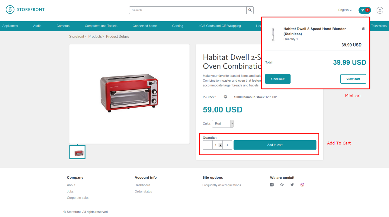
Example product page on the live storefront
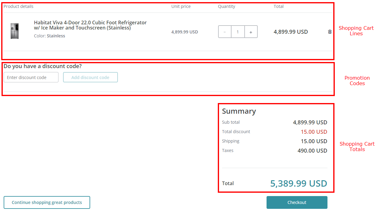
Example shopping cart page
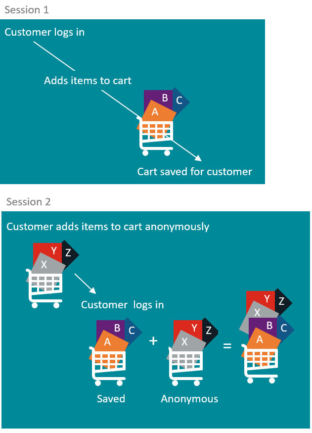
Customers can browse the storefront and add items to the cart anonymously. If the customer adds items to the cart while browsing the site anonymously, those items remain in the cart after a successful login. If the customer adds products to their cart while logged in, the products remain in the cart after the session ends. Later, if the customer adds items to the cart anonymously and then logs in, the saved cart is merged with the anonymous cart.
This topic describes the following renderings in the Commerce Cart group in the SXA Toolbox:
Add To Cart
Add To Cart
You use the Add to Cart rendering to enable the customer to add the current product to the shopping cart. You use the Add To Cart rendering on product detail pages.
When you add the rendering to a page in the Experience Editor with a basic custom theme applied, it looks like this:
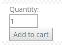
When the customer clicks Add to cart, the system validates the Quantity field. If the field is empty, a message is displayed with the default text This field is required. If the field contains a value that is not a positive integer, a message is displayed with the default text Please enter a value greater than or equal to 1.
If the Quantity field passes validation, the system adds a cart line to the shopping cart with the specified quantity, the product ID of the current product, and the catalog and variant ID as needed.
Minicart
Minicart
You use the Minicart rendering to display a summary of the contents of the shopping cart. You use the Minicart rendering on catalog and product pages.
When you add the Minicart rendering to a page in the Experience Editor with the Storefront Mock-up theme applied, it looks like this:
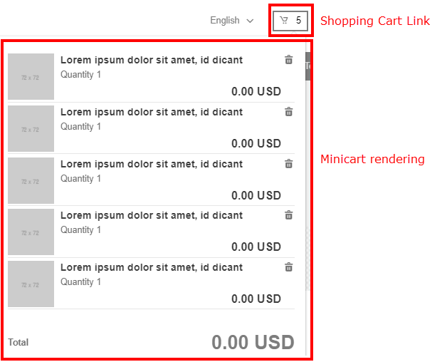
On the live storefront, the shopping cart link is visible at all times. When the customer hovers the mouse over the shopping cart link or clicks the link, the Minicart rendering appears. If there are products in the shopping cart, the shopping cart lines and total are displayed.
The customer can click a line to see product details, or click the delete icon to remove a line from the cart.
If the customer clicks View cart, the Shopping Cart page appears. If the customer clicks Checkout, the first checkout step appears.
Shopping Cart Lines
Shopping Cart Lines
You use the Shopping Cart Lines rendering to display the content of the shopping cart with a line for each product item. Each line contains the product image, the product name with a link to the product page, the variant, the unit price, the quantity, and the line total, as well as an icon to delete the line. When you add the rendering to a page in the Experience Editor, it looks like this:
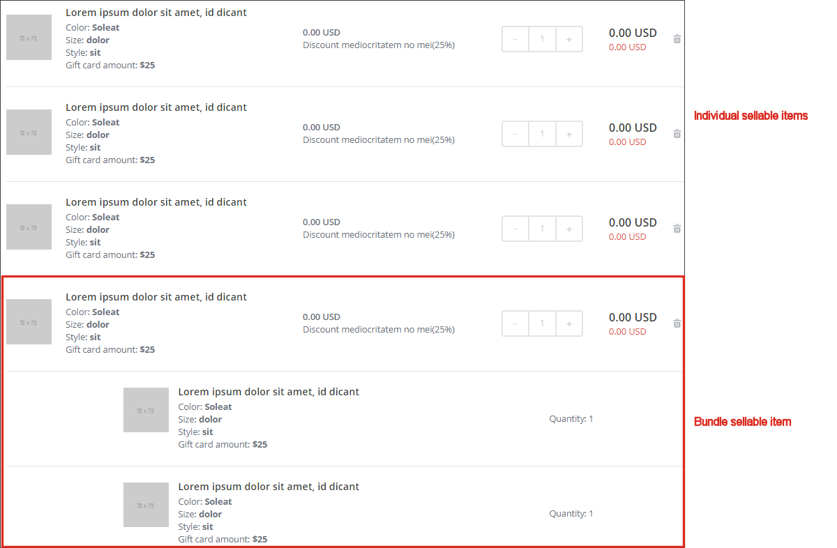
For product bundles, each individual item that makes up the bundle is shown on an indented line that displays the product image, the product name, available variants, and the quantity. The quantity shown for individual items is per bundle. On the storefront, a customer cannot change selected variants or quantities for a bundle after it has been added to the cart. Changes can only be made by removing the current product bundle from the cart and adding it back again with the desired product variants.
If any type of discount applies to a line, the type of discount appears under the unit price, and the discount amount appears under the line total.
Configuration
You configure the Shopping Cart Lines display in the Control Properties dialog box. In the Experience Editor, navigate to a page with the Shopping Cart Lines component. Select the component and, from the toolbar, click More, Edit component properties.
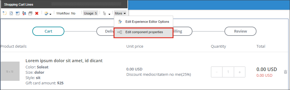
In the Display section of the Control Properties dialog box, select the check boxes next to the items you want to display in the Shopping Cart Lines section.
Scroll down to the Styling section and specify the look and feel of the shopping cart lines:
-
Compact Cart ‑ displays the Shopping Cart Lines component in a smaller and compact view.
-
Main Title ‑ sets the font size to 30px for Shopping Cart Line content.
-
No Margins ‑ sets a narrower margin.
-
Primary Button Filled ‑ displays a solid primary button (if displayed).
-
Primary Button Line ‑ displays the primary button with a border.
-
Rounded Corners Container ‑ displays the Shopping Cart Lines container with rounded corners.
-
Secondary Button Line ‑ displays the secondary button (if displayed) with a border line.
-
Secondary Title ‑ sets the font size to 18px for Shopping Cart Lines content.
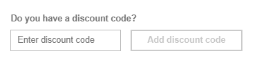
Promotion Codes
Promotion Codes
You use the Promotion Codes rendering to enable the customer to enter discount codes for their order. You use the Promotion Codes rendering on the Shopping Cart page. The customer can add a discount code in the Discount code field, and then click Add discount code. The system creates a new line in the rendering for each discount code that the customer enters. Each line contains a Delete icon, so the customer can remove the discount code.
In the Experience Editor, with the Storefront Mock-up theme applied, it looks as follows:
Shopping Cart Total
Shopping Cart Total
You use the Shopping Cart Total rendering to summarize the total amounts for the shopping cart contents. You use the Shopping Cart Total rendering on the Shopping Cart page. In the Experience Editor, with the Storefront Mock-up theme applied, it looks as follows:
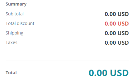
If the customer changes something in the shopping cart lines, the totals are automatically updated.