Commerce Catalog renderings
SXA Storefront includes a number of renderings that you can use to build a catalog on your storefront.
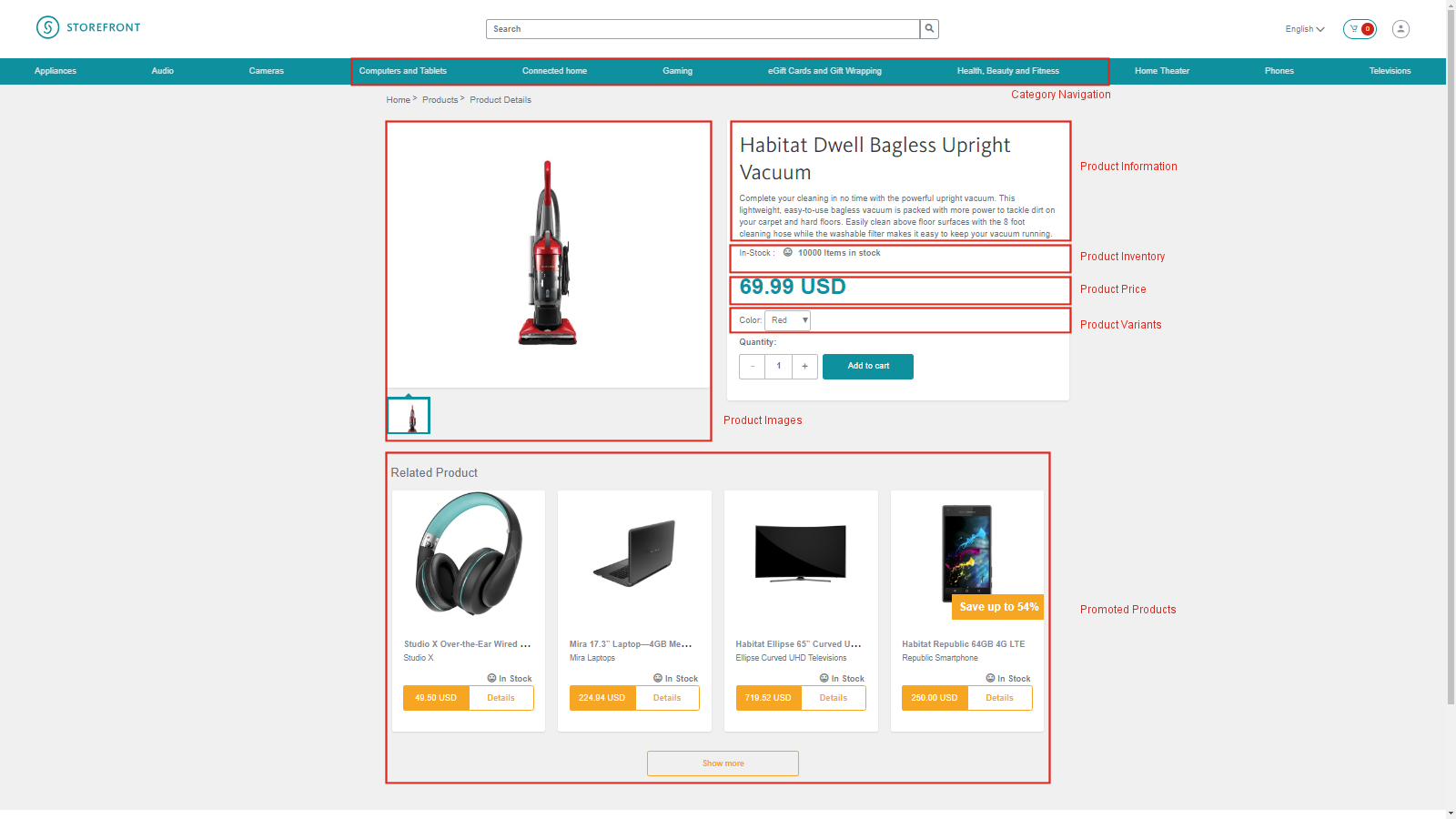
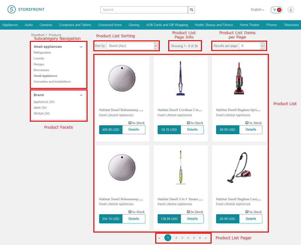
The following screenshots show examples of a product page and a category page from the SXA Storefront. The red boxes indicate the Commerce Catalog renderings used to build the pages.
Product detail page example
Category page example
This topic describes the following renderings, which are located in the Commerce Catalog group in the Toolbox:
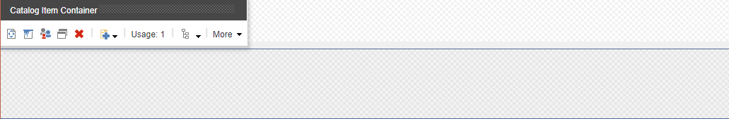
Catalog Item Container
Catalog Item Container
You can use the Catalog Item Container rendering on a landing page to set a product item as the data source for a group of catalog renderings. All the catalog renderings added inside the container rendering will use the product you select as the product context. This allows the renderings to display product information on a page where there is otherwise no product context available.
When you add this rendering to a placeholder, it does not display anything. The rendering is a container where you can drop other renderings.
From SXA version 1.7 onwards, the standard SXA container component supports similar functionality as the Catalog Item Container when setting the data source to point to a catalog item. It works with the components used in a product page (with the exception of the Product List component where only the Catalog Item Container works).
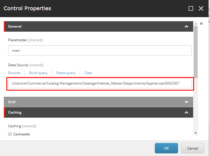
Setting the data source
In the Control Properties dialog box for the rendering, you can set the data source to a product item:
After you set the product item and add catalog renderings inside the container rendering, product information for the selected product is displayed.
Catalog renderings added inside the container rendering have the same appearance as if they were added directly to the page, so the landing page looks the same as the product detail page for the selected product.
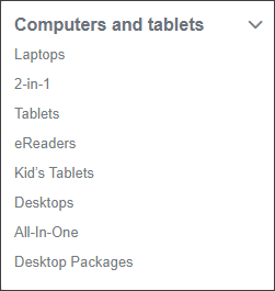
Category Navigation
Category Navigation
You use the Category Navigation rendering to display the top-level categories of your product catalog (in a menu or navigation bar for example).

The customer can navigate to a category page by clicking a category on the navigation bar.
The displayed categories are based on the content of the search index. To configure the start point for rendering categories, open the Content Editor and navigate to sitecore/<storefront>/Home/Commerce/Catalog Configuration and enter the path to the category to start with (for example, sitecore/content/Sitecore/Storefront/Home/Catalogs/Habitat_Master/Habitat_Master-Departments).
Subcategory Navigation
Subcategory Navigation
You use the Subcategory Navigation rendering to display a list of the subcategories of the selected top-level category.
In the Experience Editor, if no top-level category is selected, the rendering is displayed with placeholder text.
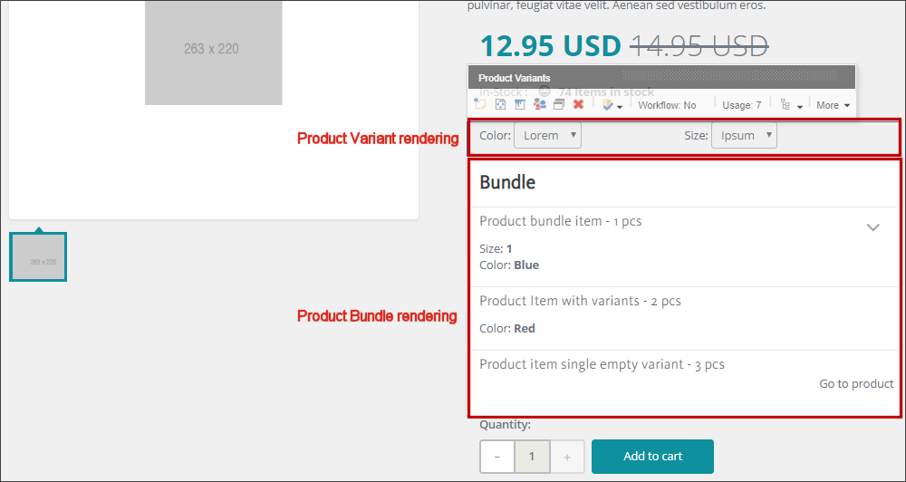
Product Bundle
Product Bundle
In a catalog, related products and/or services can be grouped together as one item. You display this item on the Storefront by adding the Product Bundle rendering to the Products page. Only static bundles are available.
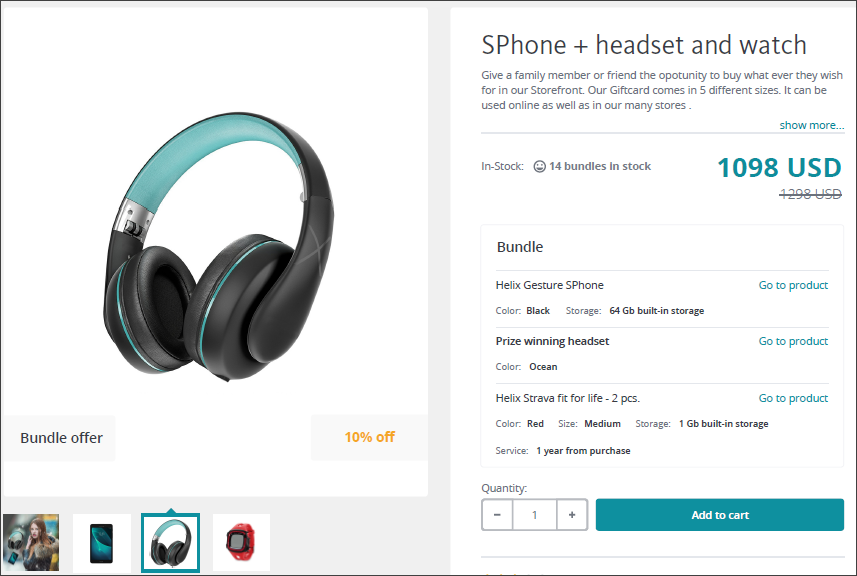
You define the bundle name, the " Go to product" text as well as the "Save up to" text in the Content Editor (<storefront>/Data/Commerce/Catalog/Product Bundle). You can also specify an information message that displays when the customer selects an invalid variant combination.
The Product Page contains both a Product Variant and a Product Bundle rendering in order to show individual products as well as bundles. Each rendering recognizes the catalog item type that it applies to and ignores the other type so only one of them ends up rendering on the page at runtime. For design purposes, both renderings are displayed in the Experience Editor.
If it is a product bundle that is to be displayed on the storefront, the product variant rendering shown above would not be displayed.
The Product Bundling feature is supported in Sitecore XC version 9.0.3 and later. For sites created with Sitecore XC versions prior to this, the Bundling component is not automatically added to the Toolbox. Follow the instructions in the Upgrade Guide to make the component available on existing sites and update the product detail page to include support for bundles.
Product Facets
Product Facets
You can add the Product Facets rendering to the category page to display a list of available facets for the currently selected category. If no category is selected, then the rendering is displayed with placeholder text.
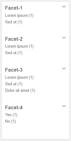
The Product Facets rendering is also used on the standard storefront Search page.
Filtering a list on the live storefront
When the customer clicks a facet value in a facet list, the facet list is filtered to only show the selected facet value, and the product list is filtered based on the selected facet value.
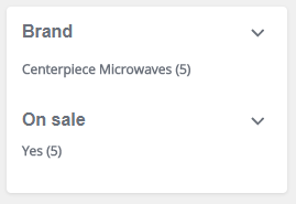
It is possible to narrow a filter by selecting multiple facets at once. If the customer clicks a selected facet value, the facet is removed from the search filter.
Product Images
Product Images
You can add the Product Images rendering to a page in the Experience Editor to display thumbnail images for each image related to the selected product. One thumbnail is selected, and a larger image of the selected thumbnail is displayed. If no product is selected, placeholder images are displayed.
Product Information
Product Information
You can add the Product Information rendering to a page in the Experience Editor to display the product title, description, and item number.
Alternatively, you can use variants of standard SXA renderings to display product information. This allows you to control the placement of the product name, description, and item number independently of each other.
Product Inventory
Product Inventory
You can add the Product Inventory rendering to a page in the Experience Editor to display the current stock status and number of items in stock as [stock status] / [stock count]. When no product is selected, placeholder data is displayed.

If the product is out of stock, the Add to cart button is disabled.
Product List
Product List
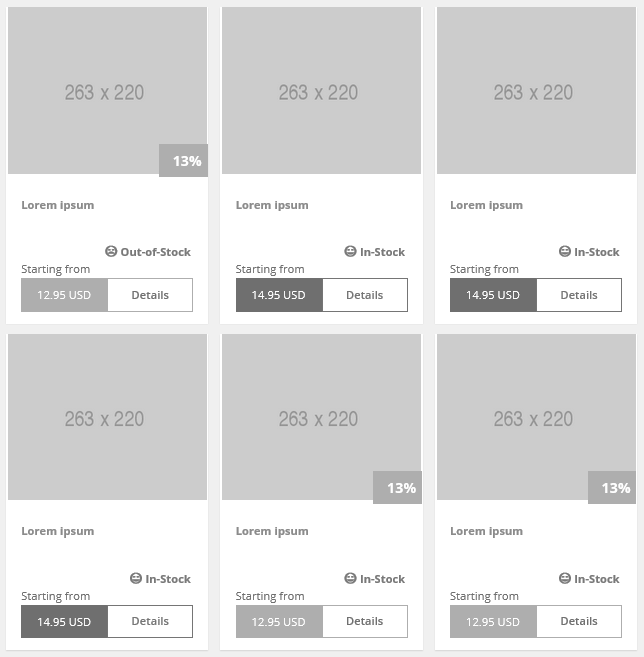
The Product List rendering displays a list of products with the product image and price, and a link to the product page. If you place the Product List rendering on a category page, it displays the products for the selected category. If no category is selected, placeholder images and data are displayed.
The Product List is also used on the Search page to display search results, which can be a combination of products and categories.
You can place the Product List Items per Page, Product List Page Info, and Product List Sorting renderings above the product list to enable the customer to configure the order of the products in the list and the number of products displayed per page.
If you prefer to display all products in the list on the same page, you can configure the list to use lazy loading.
When a product has variants of different prices, the lowest available price is displayed, prefixed with a text, for example, Starting from. If no variants are defined, or if all variants have the same price, the price is displayed without the text.
If a product is on sale at a discounted price, an overlay banner appears overlapping the product picture and displays the amount of the discount as a percentage of the original price. The price that appears in the product list is the discounted price.
The current stock status of the product is displayed.
The customer can navigate to the product details page by clicking the product image or the Details link.
Product List Items per Page
Product List Items per Page
If you place the Product List Items per Page rendering above the Product List rendering on category and search pages, the customer can select the number of items displayed per page.
Default items per page
In the Commerce Control Panel, you can define a default value for all pages. Enter the overall default value in the Catalog Configuration item, in the Default Items Per Page field:
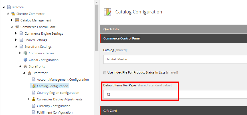
This is the number of items that will appear on the page until the user selects a different value.
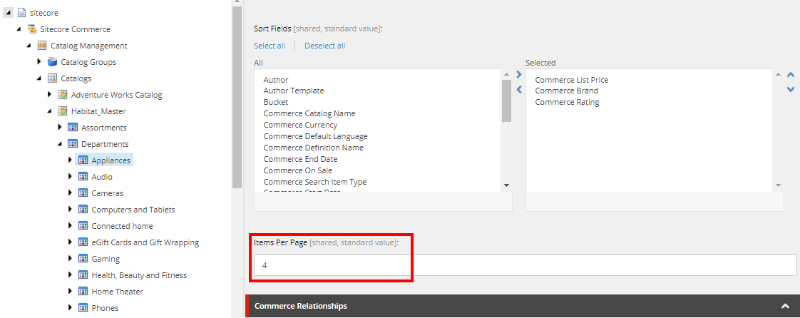
You can configure the value in the Items Per Page field for a specific category page on the Category item. This value overrides the default from the catalog configuration. In the following example, the default number of items that will appear on a page for the Appliances category has been defined as 4:
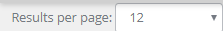
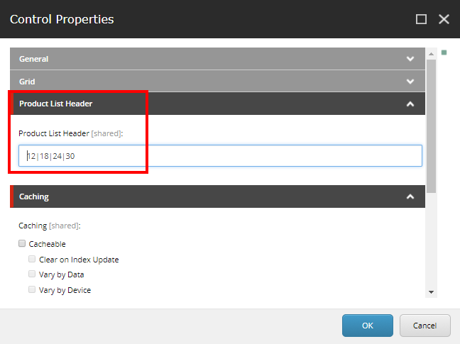
Options in the drop-down menu
In the Control Properties dialog box for the rendering you can change the options included in the Results Per Page drop-down menu.
Product List Page Info
Product List Page Info
If you place the Product List Page Info rendering above the Product List rendering on category and search pages, the rendering indicates the total number of items in the category or search, and it indicates which items from the list are shown on the current page.
Product List Sorting
Product List Sorting
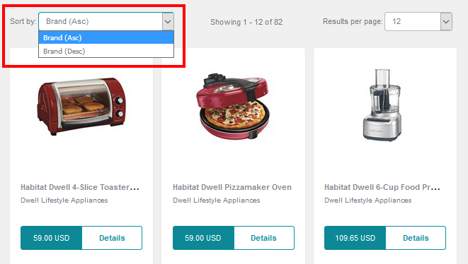
If you place the Product List Sorting rendering above the Product List rendering on category and search pages, the customer can use the rendering to sort the category or product list.

Sort options
The options available in the Sort by drop-down menu are the sort fields that have been defined for the category item. You can configure the sort fields on the Category item. The following is an example of the defined values for the Appliances category in the Habitat catalog:
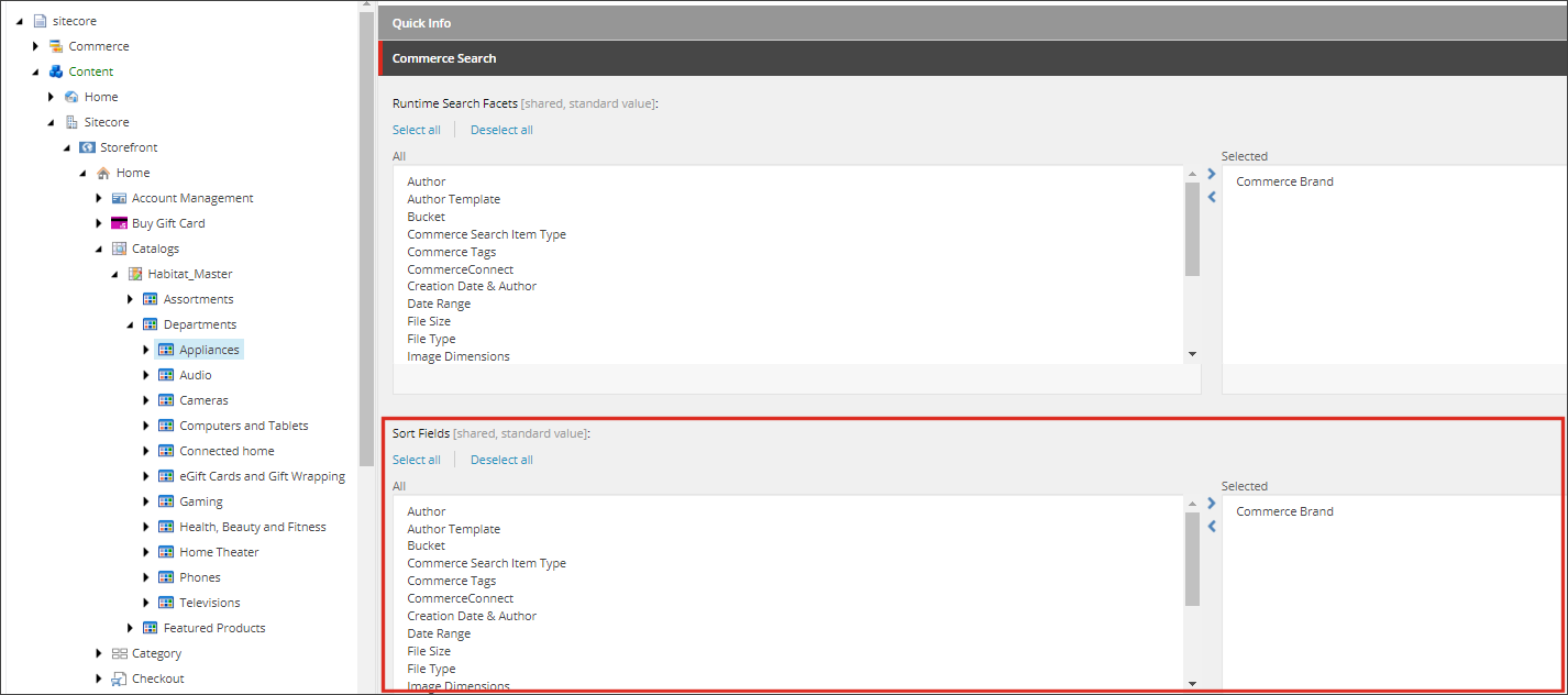
The Sort by field lists the sort criteria in the Selected field, with an ascending (Asc) option and a descending (Desc) option for each.
This gives the following result on the live storefront:
Product List Pager
Product List Pager
You can use the Product List Pager rendering on category and search pages. It allows the customer to navigate through the product list. The current page is highlighted in the Product List Pager rendering. The customer can click a page number or they can click Next or Previous
 to navigate between pages.
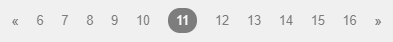
In the SXA Storefront, this rendering appears twice on each category and search page – above and below the Product List rendering.
Product Price
Product Price
You can use the Product Price rendering to display the product price. If the product is on sale, the discounted price is displayed, and the original price is displayed in strikethrough font.

Product Variants
Product Variants
The Product Variants rendering displays a drop-down menu for each variant field (for example, one for size and one for color). If the customer selects an invalid combination, an error message is displayed in the message area and the Add to cart button is disabled.
In the Experience Editor, the rendering displays only a placeholder.

In the case of gift cards, the value of the card can be a variant.
Promoted Products
Promoted Products
The Promoted Products rendering displays a list of products in a format similar to the Product List rendering.
There are three types of lists that can be displayed in the Promoted Products rendering:
-
Named search – a dynamic list of products that is created by searching the product catalog at runtime.
-
Selected products – a static list of selected products.
-
Related products – a list based on relationship data from your commerce system.
In the SXA Storefront, the home page contains an example of a promoted products list that was configured for the page, and the product details page contains an example of a related products list based on relationships in the catalog.
When you insert the Promoted Products rendering in the Experience Editor, it contains placeholder data:
Configuration
After you add the Promoted Products rendering to a page, you must configure it. You create a Product List and configure the Promoted Products rendering to display it.
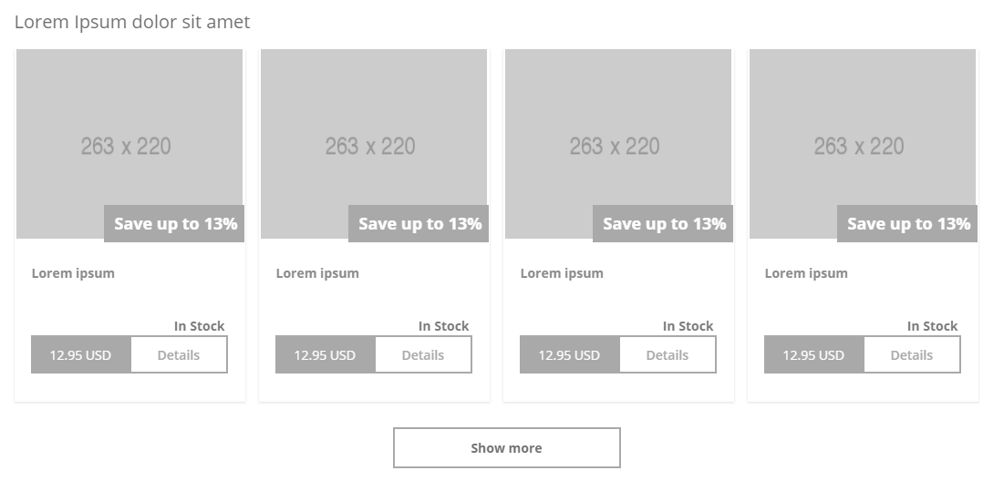
Lazy loading
You enable lazy loading to make a Show More button appear underneath a list of products, as illustrated in the previous screenshot of the Promoted Products rendering. When a visitor to your storefront clicks Show More, more items are loaded and displayed in the list. This is an alternative to displaying a fixed number of items at a time.
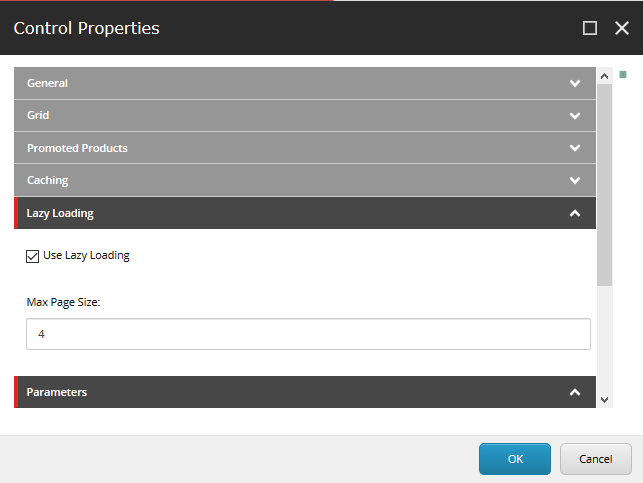
You can configure lazy loading for either the Promoted Products rendering or the Product List rendering. In the Control Properties dialog box for the rendering, under Lazy Loading, select the Use Lazy Loading check box. In the Max Page Size field, indicate how many items you want to appear in the list when the visitor arrives on the page. This is also the number of items that are added to the list each time the visitor clicks Show More.
Normally, you either enable the Show More button or insert a product list header that includes the Product List Items per Page rendering. They are not designed to be used together, and the lazy loading settings override the selection in the Results per page field if they conflict.
Search Initiated, Visited Category Page, and Visited Product Page
Search Initiated, Visited Category Page, and Visited Product Page
You can place the Search Initiated, Visited Category Page, and Visited Product Page renderings on pages to track visitor behavior. Each of these renderings makes an individual call to the Commerce Connect API to trigger an associated page event in xDB. You can view the resulting data in both Experience Profile and Experience Analytics.
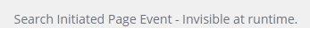
These renderings are invisible on the live storefront, but they appear on the page in the Experience Editor so that they can be located and edited. For example, the Search Initiated rendering appears like this in the Experience Editor:
When a search is initiated from the search bar on a page with the Search Initiated rendering, the rendering triggers the Search Initiated page event in Commerce Connect. In the SXA Storefront template, the Search Initiated rendering is included on the Default Commerce Header partial design.
When a customer visits a page with the Visited Category Page rendering, the rendering triggers the CategoryPageVisited page event in Commerce Connect. In the SXA Storefront template, the Visited Category Page rendering is included on the category pages, in the main content area.
When a customer visits a page with the Visited Product Page rendering, the rendering triggers the ProductPageVisited page event in Commerce Connect. In the SXA Storefront template, the Visited Product Page rendering is included on the product detail pages, in the main content area.