HTML block appearance styles
You can select the following Sitecore Discover HTML block appearance styles.
Free Form HTML Block
Select this option when you want to create your own HTML code to create an appearance style.
Paste your HTML in the free-form Content field. You do not have to configure any other settings.
Title and description
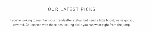
This appearance style has a title and an optional description.
The following image shows an example of the title and description appearance style:
To use this appearance style, configure the following settings:
- Basic Settings
- Advance Settings
- Fonts Settings
- Box Model Settings
Call To Action - Horizontal desktop - Vertical mobile
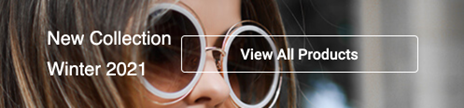
This appearance style has an image, content, and a button. It appears horizontally on desktop and tablet devices, and vertically on mobile devices.
The following image shows an example of this appearance style on a desktop:
To use this appearance style, configure the following settings:
- Basic Settings
- Container style settings
- Image style settings
- Title style settings
- Content style settings
- Button container style settings
- Button style settings
- Button normal state settings
- Button hover state settings
Call To Action Vertical
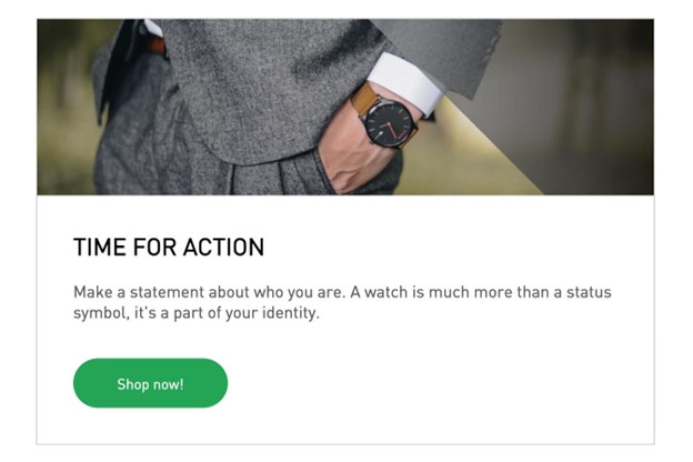
This appearance style has an image, content, and a button. It appears vertically on all devices.
The following image shows an example of this appearance style:
To use this appearance style, configure the following settings:
- Basic Settings
- Container style settings
- Image style settings
- Title style settings
- Content style settings
- Button container style settings
- Button style settings
- Button normal state settings
- Button hover state settings
Image Grid
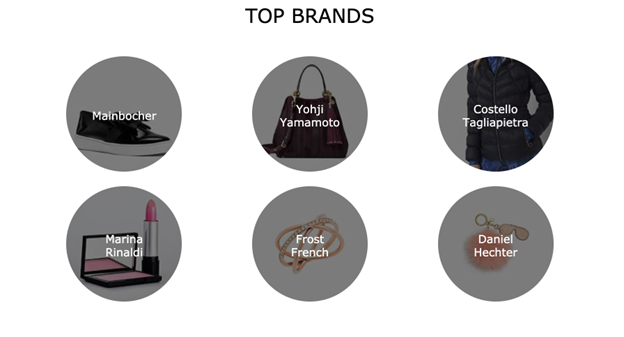
This appearance style has a grid of up to ten images with titles.
The following image shows an example of this appearance style:
To use this appearance style, configure the following settings:
- Basic Settings
- Slot settings
- Container style settings
- Title style settings
- Slot style settings
2-3 Tabs
This appearance style has horizontal tabs with a widget container for each tab.
The following image shows an example of this appearance style:
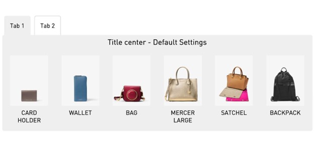
To use this appearance style, configure the following settings:
- Basic Settings
- Tab settings
- Container style settings
- Title style settings
- Slot style settings