Set placeholder restrictions
To have some control over the components that can be placed in a placeholder, you can set placeholder restrictions. For example, if you want the footer design to be simple, without too much information, you can restrict complex components.
In the Content Editor, you can set placeholder restrictions for your layout placeholders. These restrictions are applied on all pages in the site. For example, if you add restrictions for a footer, these apply for all footers on every page of the site. In this way, you can control the content that content authors can place in layout placeholders.
To add a placeholder setting for a site:
-
Navigate to the Presentation folder of your site, right-click Placeholder Settings, click Insert, and then click Placeholder.
-
Enter a name for the placeholder item and click OK.
-
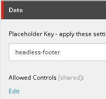
In the Data section, enter the placeholder key as it appears under Layout/Placeholder Settings/Foundation/Headless Experience Accelerator/Placeholder Settings, for example headless-footer.
-
in the Allowed Controls field, click Edit.
-
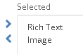
In the Select Items dialog box, navigate to Layout/Renderings/Feature/Headless Experience Accelerator, select the components that you want to enable, and then click OK. For example, if you want a very simple footer, enable only the Rich Text and Image components for the footer.
-
Save the placeholder setting.
When you set restrictions for a dynamic placeholder, the restrictions might not be applied if the placeholder key contains an additional numbered segment. For example, restrictions might not be applied to a placeholder with a key such as content-switcher-tab-1-{*}. To apply the same allowed controls to all matching placeholders, create or update the placeholder settings item and use a wildcard key without the numbered segment, for example content-switcher-tab-{*}. If individual placeholders require different allowed controls, create a separate Placeholder Settings item for each full placeholder key, for example content-switcher-tab-1-1 and content-switcher-tab-1-2. These approaches don't require changes to your Next.js implementation.