Use dynamic placeholders in components
Use dynamic placeholders to generate unique placeholder keys every time a container component is placed on a page (for example, container-1, container-2). This ensures that content authors can place multiple instances of the same container component onto a page without the Layout Service mixing up which child components belong to which container. In some cases, multiple placeholder keys are generated within a single component instance, such as when adding columns to a Column Splitter component.
Dynamic placeholders are managed entirely by the Wrapper (container) component and Placeholder Settings. The child components placed inside the dynamic placeholder do not require any special templates, properties, or TSX configuration.
This walkthrough describes how to configure a container component to use and render dynamic placeholders.
- Create the Wrapper component.
- Create the Dynamic component.
- Connect the components.
Create the Wrapper component
The Wrapper component is a container component that defines and renders the dynamic placeholder. It owns the placeholder key and controls layout. To configure the Wrapper component, you must enable dynamic placeholders on its rendering item, add the base template for dynamic placeholder IDs to its rendering parameters, and implement the placeholder in its code file (.tsx).
To create the Wrapper component:
-
In the content tree, navigate to /sitecore/Layout/Renderings/Feature/Headless Experience Accelerator and click the component you are interested in.
-
In the Other properties field, enter the
IsRenderingsWithDynamicPlaceholdersproperty and set its value to true.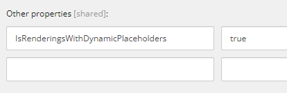
-
Save your changes.
Define the placeholder key using a wildcard
You use a wildcard as part of the definition of the placeholder key. As a result, whenever an instance of the container component is added to the placeholder, the DynamicPlaceholderId parameter generates a unique ID that dynamically replaces the wildcard used in the placeholder key value, for example myrendering-1, myrendering-2, and so on.
To define the placeholder key using a wildcard:
-
In the content tree, navigate to the placeholder settings item of the container component that you want to enable dynamic placeholders for. Depending on where your components are stored, the settings item might be in one of the following locations:
-
/sitecore/Layout/Placeholder Settings/Feature.
-
/sitecore/Layout/Placeholder Settings/Project.
NoteIf the settings item does not already exist, create one and name it according to how your component is named.
-
-
Click the settings item and, in the Placeholder Key field, enter the name of your component as defined in the component TSX file followed by -{*}, for example myrendering-{*}.
-
Save your changes.
Create the Dynamic component
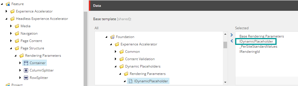
The Dynamic component refers to the child or nested components inside the placeholder. It behaves like a standard component and has no awareness of dynamic placeholder keys. Adding the IDynamicPlaceholder base template to the rendering parameters template of the container component creates a parameter called DynamicPlaceholderId, which dynamically assigns IDs to the placeholder key.
To create the Dynamic component:
-
In the content tree, navigate to the Rendering Parameters folder and select the rendering parameters template.
NoteThe folder's location can differ depending on your instance, but it is typically found in /sitecore/Templates/Feature.
-
On the Content tab, navigate to /Templates/Foundation/Experience Accelerator/Dynamic Placeholders/Rendering Parameters.
-
Double-click the IDynamicPlaceholder item to move it to the Selected section. The following example shows the rendering parameters template of the built-in Container component.
Connect the Wrapper and Dynamic components
To connect the Wrapper component and the Dynamic components, you need to define a placeholder key, link the components together through placeholder settings, and then define the placeholder key in the container component TSX file.
Link the placeholder settings item to the container component
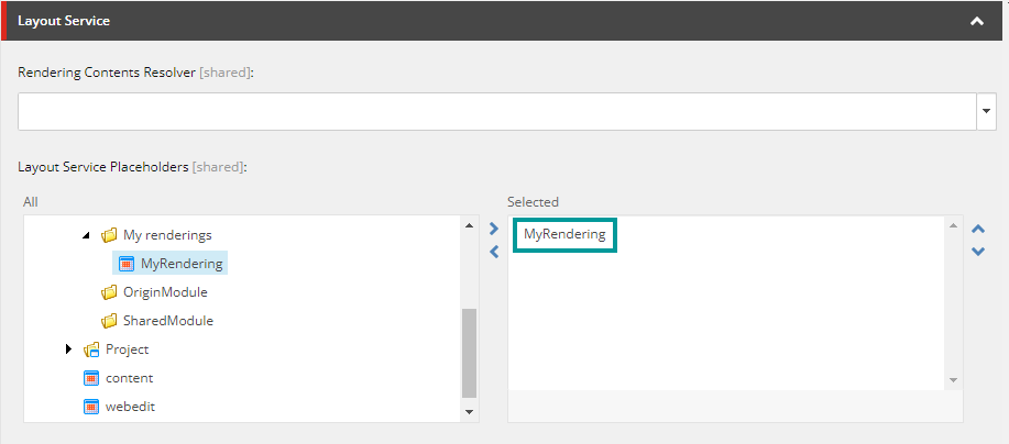
To be able to render the child components inside the placeholder, link the placeholder settings item with the container component through the Layout Service.
To link the placeholder settings item to the container component:
-
In the content tree, navigate to sitecore/Layout/Renderings/Feature, open the folder that holds the container component, and then click the component.
-
In the Layout Service Placeholders field, navigate to the placeholder settings item that you configured previously.
-
Double-click the placeholder settings item to add it to the Selected pane.
Define the placeholder key in the container component TSX file
In the container component TSX file, when you define the placeholder component, you need to pass the name in the Placeholder Key field to the phKey constant. Instead of a wildcard, you need to use the DynamicPlaceholderId from the rendering parameters as shown in the following example: