Resizing columns
The maximum size of a row is 12. Suppose you have two equally sized columns with the total size of 12, and you add an extra column, then the maximum size has been exceeded. What happens is that the extra column is moved to the next row and, by default, assigned the value 12. This is illustrated in the picture below.
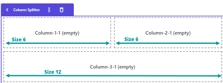
If you want all three columns to appear within the same row with the same size, you must manually adjust the size of each column and give them the value 4.

To resize a column, select the column you want to resize. On the right-hand side, expand Layout and select a size.
The unit of measure used for the size of columns is relative, where one unit is one twelfth of the total size. Because the total size is 100 %, then one size unit is 100/12 = 8.333 %.
Configure responsive columns for mobile and larger screens
When using the Column Splitter component, always configure column layouts with mobile devices in mind first, then adjust the layout for larger screen sizes as needed.
The grid layout system is based on Bootstrap's responsive breakpoints and inherits settings from smaller screen sizes by default. This means that if a breakpoint is not explicitly configured, it uses the settings from the closest smaller breakpoint.
To create a layout that stacks on mobile and displays side-by-side on larger screens:
- In Page builder, click on the Column Splitter component inserted in your page.
- In the canvas context toolbar, switch to the smallest viewport in Page builder, for example, Mobile.
- Select each column in the Column Splitter component, and in the right-hand confuguration panel, in Design > Layout > Size, set the Column span value to 12 for each column. This causes the columns to stack vertically on mobile devices.
- In the canvas context toolbar, switch to the smallest breakpoint where you want the columns to appear side-by-side, such as Desktop Small.
- Select a column, and in the right-hand confuguration panel, in Design > Layout > Size, click Override inheritance.
- Set the Column span to the desired width, such as 6 for a two-column layout.
- Repeat the configuration for the remaining columns.
Because the layout at this breakpoint overrides the inherited mobile settings, the columns remain stacked on mobile devices while displaying side-by-side on larger screens.
After making changes, review the layout at every breakpoint you support. If a larger breakpoint is not configured, Page builder inherits the layout from the closest smaller breakpoint, which can produce unexpected results on tablets or desktops.